Thursday, 30 November 2017

Advertising & Marketing

When a new product is released a company must decide on the marketing campaign. The Marketing Team focus on many aspects that focus on the type of advertisement, the target audience and how they are going to sell the idea of the product. 


The Video


In the Fenty Advertisement is shows a group of girls from different skin tones and focuses on the make-up. It also shows the the Fenty beauty also focuses on different types of girls and their complexion's and other corresponding products that work with different skin tones.
In the beauty industry, their hasn't been a breaking through product that doesn't have 5 generic shades for people of colour. The Fenty collection, specialises in making everyone women beautiful and for make-up to enhance their beauty and for it to feel and look like skin.  


Wednesday, 1 November 2017

Film Industry Branding

BRANDING 

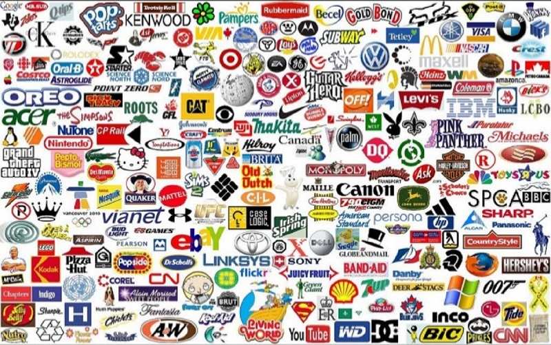
A Brand is a type pf product made by a particular company under a particular name.

Image result for famous brands


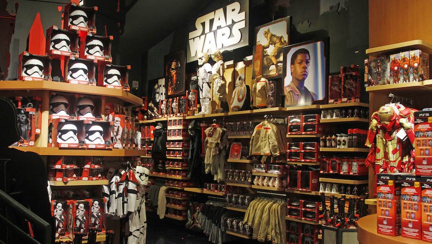
Branding is important in the Film industry because it makes more money. When making a film there are other factors such as merchandise, DVDs, Casts. That factor in making profit and selling their film such as the Star Wars Franchise.

Image result for star wars merchandise


TECHNOLOGY


Over time, Technological advances has changed the relationship between brands and its consumers. Much like the WEB.10 , The internet was only had published content. Which meant that people were taking in information. There wasn't a large amount of User generated content being put out in the 1996,which was the early days of the internet. Now There is an increase in user generated content and we a no longer consumers but prosumers.  This is called the WEB 2.0 .

Image result for technological convergence

Technoligical Convergance, is a big factor in the development of Technology.It is the coming togehter of media technologies. Consumers help develop and evolve the changes in technology as a well as a company bringing out new ideas, this helps bring new media, such as camera phones,iPods and many others. We can now stream music and movies online on our Phones,Tablets and Gaming Consoles.


THE FILM INDUSTY 

These factors links in with the film industry because these are the things the help promoted the movie and to market a film. Technological convergance gives the indusrty an exra platform to advertise and sell a film.

Wednesday, 18 October 2017

FLAT PLAN VS FRONT COVER

I made my flat plan before I took my photo's because, I wasn't sure what to put on their  front cover at first. I also had lots of space for text. My Masthead was much smaller compared to my final. My original Idea was very basic and I wasnt't yet sure what I wanted to put into the magazine.. I used this as a guide to use when I was making my designs and how I wanted it to look like. I change the size of my masthead and moved the anchor to the front of the magazine. Overall, I liked the changes in the design because the layout looks more officiant.


MODEL CONSENT FORMS


FINAL STAGES!


In the final stages of making my design. I also focused on making the words readable and not too add too many added on words.I first wanted to make the magazine cohesive and to stick to less the 3 fonts and colour. 

As my model is facing the right and has hair covering the most of the left side.  I didn't want her face to be cluttered with texts, and graphics.
I changed the colour of the graphic so it could stand out and I also added shading to make it 3D and stand out. I also changed the font to match the the name of the artist 


I wanted the 'Cleopatra' to stand out. I didn't use a white colour as it is part of  neutral colour as I have used a lot of black. I added a white outline on white title to bring out the text.

SHOT LIST


Here is my ideas for shots for my music cover.

  1. In the First Shot, I wanted a medium close up to show my model more and too see their facial expression. This is a eye level angle with the model looking straight at the camera.
  2. In the next shot I wanted the model to be closer to the camera. This is a close up at eye level again I wanted to shop the expression of the face but also to show their make-up.
  3. This next shot has is at a low angle to make the model look empowering and in-control.
  4. I wanted a medium shot to have space more graphics and text and to show off what they're wearing.
  5. In this show I wanted an extreme close-up of the model at a low angle to show the model to  be powerful and dominant.
  6. In this final shot I wanted a low angle with the model at a slight angle, through its poorly shown in my drawing. I wanted a side angle of the model to show the different side of the model.

Tuesday, 17 October 2017

MAKING MY MAGAZINE

Here is the process I went through when making my Final Cover.


I wanted to change in lip colour. In order to do this I went onto the layer with the image and used the magnetic lasso over Petra's lips. I went onto adjustments and hue/saturation and I experimented with the colours.


After Choosing my lip colour, the colours weren't co-ordinated with the masthead . I changed the colour to Orange because I went with the Petra's headscarf . I moved the anchor so that it is at the front of the magazine cover.

Next. I procceded to add more text and add puff', list of feature articles, and the name of the artist. I change the font for the Anchor. I using the white box as a guide.


Monday, 16 October 2017

CHOOSING MY FINAL PHOTO


THE PROCESS:

When choosing, my photo for my music magazine I went through a series of taking pictures with different angles. Originally, I wanted to people in the shot.


In this Photo on the top , this I didn't like the background of the photo  as it was slightly lumpy at the top. The models needed to look close together because in this shot they were  far apart from each other. 
In the next photo, the models are much closer and the background is clearer. To improve this photo, I would've moved the camera closer for a close up  shot.

In The Photo below, the model on the right took off her glasses which helped see her face and her eyes.


After Taking a series of Photos theirs were the 3 that I liked then I decided to take individual photos to see which ones I'd prefer in my final magazine cover.


Conclusion: I've decided to stick to one model in my magazine cover instead of 2 people. I would also like the model to wear a colour related to my magazine cover.


Photos of Petra (my model)


I decided to choose this photo as I like the pose and the headband style on the model. I liked how this photo turned. I liked the angle and the  out, however the lighting on Petra's face was quite dark. I'm going to use Photoshop to add light to her face.

READER PROFILE


XXL Music Magazine Reader Profile.

I'm going to do a reader profile for XXL Magazine because it is a Hip-Hop genre which is closely related to the Afro Beats genre. 

Related image.

This is Priscilla, she is 18 years old and goes to College/Sixth Form . She is currently studying Biology,Psychology and Photography. Priscilla lives and goes to school in London and her family have African origins.

She enjoys going out with her friends ,  music festivals and concerts ,relaxing  to music, watching TV and going to parties. Her favorite artist is Beyonce and Drake. She enjoys reading XXL magazine and reading about her favorite artists but she would like to see more female artists on the front covers.

 Priscilla also enjoys listening to Afro beats because it is fun and energetic and she likes  artists such as Fuse ODG. Priscilla would like Afro Beats genre to have its own magazine to inspire other upcoming artist and also to Afro beats its own musical platform. 

Wednesday, 11 October 2017

EXPERIMENTING WITH PHOTO's

EXPERIMENTING WITH PHOTOS

I decided to take a series images to experiment with different settings in a photo and also different lightnings. I'm also interested in taking pictures in outside and seeing the comparison to the lighting in the studio.

I took a head shot of Mahreen, here I was experimenting with different shots. On the bottom left I took an image of Aisha with a Medium shot. There is a lot of space in this medium shot.


I choose one of the images on the right to experiment and put together my music magazine and how it would look like with an Image with my masthead.


In Photoshop I edited the image slightly by increasing the brightness and contrast. On of negatives of working with natural lighting is that I can't control the shadow casted behind the subject. From my experiments, I've deceived  to take a brand new set of photos in the studio becasue I have better control in lighting.

Monday, 9 October 2017

MY MASTHEAD

MASTHEAD PROCESS


I typed up names that could be my new magazine masthead. First, I through about the theme/genre. I am doing a magazine article about Afro Beats. I research fonts that are influenced by the African genre. Went through a process were I selected the name for my magazine.
A Masthead has to be short and catchy so it is easy to remember. At first the names I originally came up with were long. I finally came up with the name 'Afro Heat' and I began to work on making the masthead on Photoshop.


In Photoshop I want the masthead to be red because it has connotations towards heat,fire and also red can be used to represent Africa. I have chosen to remove the arch on the masthead, as I doesn't look professional, it also didn't give me room to add the exclamation mark that I originally design on my rough layout plan. I removed the red and orange gradient as I wanted to red to stand out more on its own. After removing the red, I added 3d elements into my masthead. I added the inner glow,inner shadow. out shadow and outer glow to add dimension. I also used the Blending and contour tool  to create the same effect.


This is my final masthead. I like the white outline on 'Heat' and I also added  a shadow effect on the exclamation mark. I like the 'afro' font as it s african but not overdecorative which was what the previous african , type fonts had in common. I also change the shape of the red rectangle. I made it slightly longer, so I could fit in the exclamtion mark. 

MAGAZINE DECONSTRUCTION


INITIAL IDEAS

DESIGN BRIEF


I've been asked to design and make a front cover for a music magazine using Photoshop.


Advertising & Marketing

When a new product is released a company must decide on the marketing campaign. The Marketing Team focus on many aspects that focus on the ...